UX Design Project - PetSafe Brands

Simplifying the interface and interactions of a physical product improving the experience
Picture you are the new lead user experience designer working at a company that is an established leader in the pet containment and pet tech industry.
You’ve just bee onboarded to a connected fence project as the lead designer and you need to get up to speed on the work that’s already been done by previous teammates so you can start contributing to the project.
As you start stakeholder and cross-functional teammate interviews, you uncover communication issues and opportunities to simplify and improve the physical product interface.
To validate your assumptions these changes are feasible, you need to continue collaboration with project teammates and stakeholders.
The Problem
What I Did
-

Researched the Product
I talked to the engineering team to understand how the system worked and the inputs and outputs needed to communicate system status and interactions to our users.
-

Ideated on Interaction Elements
I took the learnings from my conversations and ideated what the interactions and feedback should be–highlighting opportunities to simplify the interface and reduce product complexity.
-

Created an Interaction Spec
I created an interaction specification document outlining each interaction and feedback element and suggested removing several unnecessary status indicators reducing complexity and product development costs.

Key Project Takeaway
Communication is an integral part of any project. Establishing relationships with the engineers and making an effort to stay in contact with them regularly meant I was able to identify the issues with the UI and spec early on and make the necessary changes.
-
Challenges
• Turnover of UX teammates on this project caused issues keeping track of project work and documentation.
• Defining UI elements months before functionality was determined caused rework and confusion.
• Staying up to speed on multiple projects with large teams also contributed to rework and confusion.
-
Learnings
• Maintaining relationships with other project team members encourages more frequent communication and updates.
• Being proactive by regularly contacting other project team members led to the early discovery of new information.
• Asking questions to understand the reason behind decisions enables you to make educated suggestions.


Discovery Stage
The UX team began work on this project ahead of any hardware work. We were tasked with creating app assets and defining interaction elements before the functionality had been fully defined.
Product Research
When I became the lead designer on this project, I needed to get up to speed on the interaction elements previously defined.
At this point, work on the hardware had begun, and the assumptions previously made now needed to be updated since they were no longer accurate or feasible.
I met with members of the engineering team to get an update on their progress and talk through changes they had made to the existing interaction specification from UX.

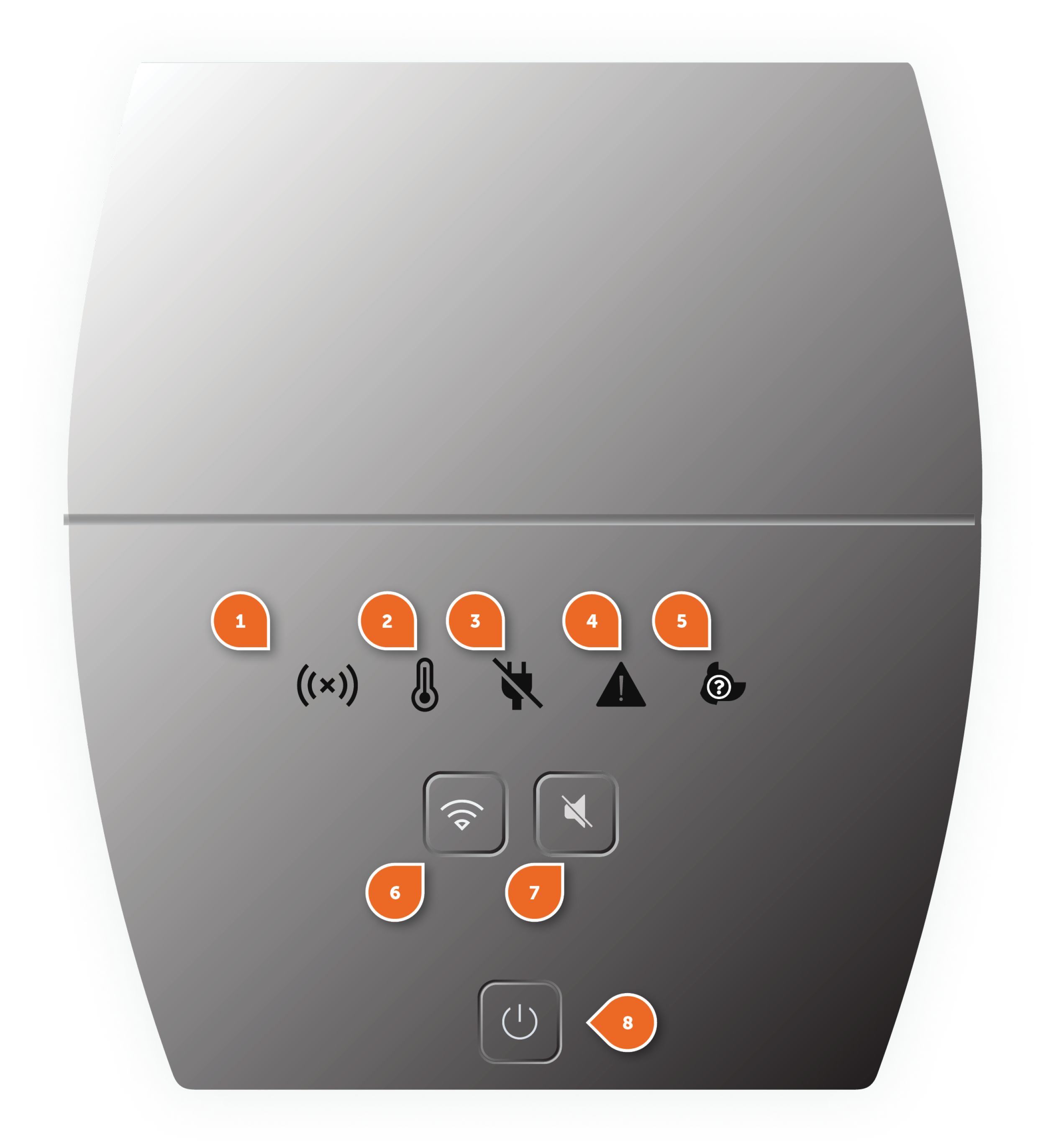
The initial base unit interface was based on the existing product UI that included a small screen to display error icons if the system was experiencing a corresponding error.
The interface also included three buttons for powering the system on/off, Wi-Fi provisioning and resetting, and muting error alarms.
Base Unit Interface Version 1

Base Unit UI Prototype
The engineers created a 3D prototype of the base unit with a functioning UI for evaluation and testing. After seeing the product interface, I noticed several elements deviated from the initial spec and identified multiple issues with the experience based on usability guidelines and our experience principles.


Fact-Finding & Discussion
After observing the changes and problems with the UI, I met with the engineers to discuss why certain decisions were made. While talking with the engineers, I asked questions and made suggestions that would improve the UI. Having an open conversation allowed us to discuss potential changes and limitations making the interface better for our users.
Unclear Icons
The original icons from the existing wireless fence product were used and not optimized for light creating readability issues.


Overwhelming UI
Although not all these icons would be lit simultaneously, the bleeding, readability, and functionality issues created an unnecessarily complicated UI.
Clear Panel
While the intention was to hide the icons when there were no errors, the clear panel created light bleeding issues for the backlit buttons.
Proximity Issues
Separating the error indicators from their related button did not follow our usability principles and could confuse users about the button functionality.

Updating the Interaction Spec
Next, I took the learnings from my discussion with the engineers, reevaluated the existing spec, and edited it to reflect the changes we discussed and aligned to.
Base Unit Spec
Since the wireless fence was a connected product and we could provide more context in the app, I combined the error icons with the mute alarm button to indicate the system was experiencing an error and allow mute the alarm functionality by providing specifics and troubleshooting tips in the app.
These changes saved money by reducing the number of LEDs used in the interface and improved the usability and experience of the product. A win for the business and for the customer.
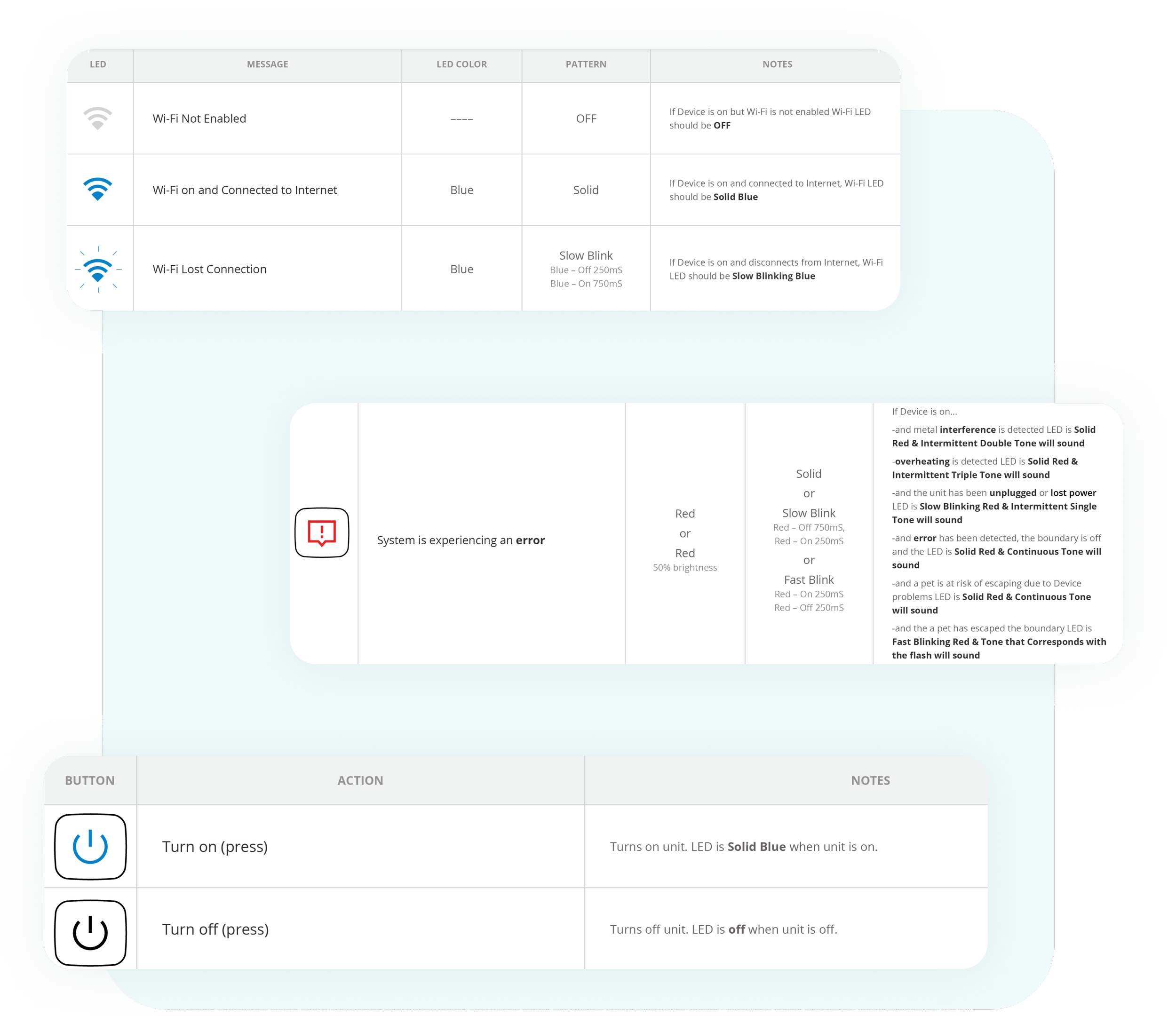
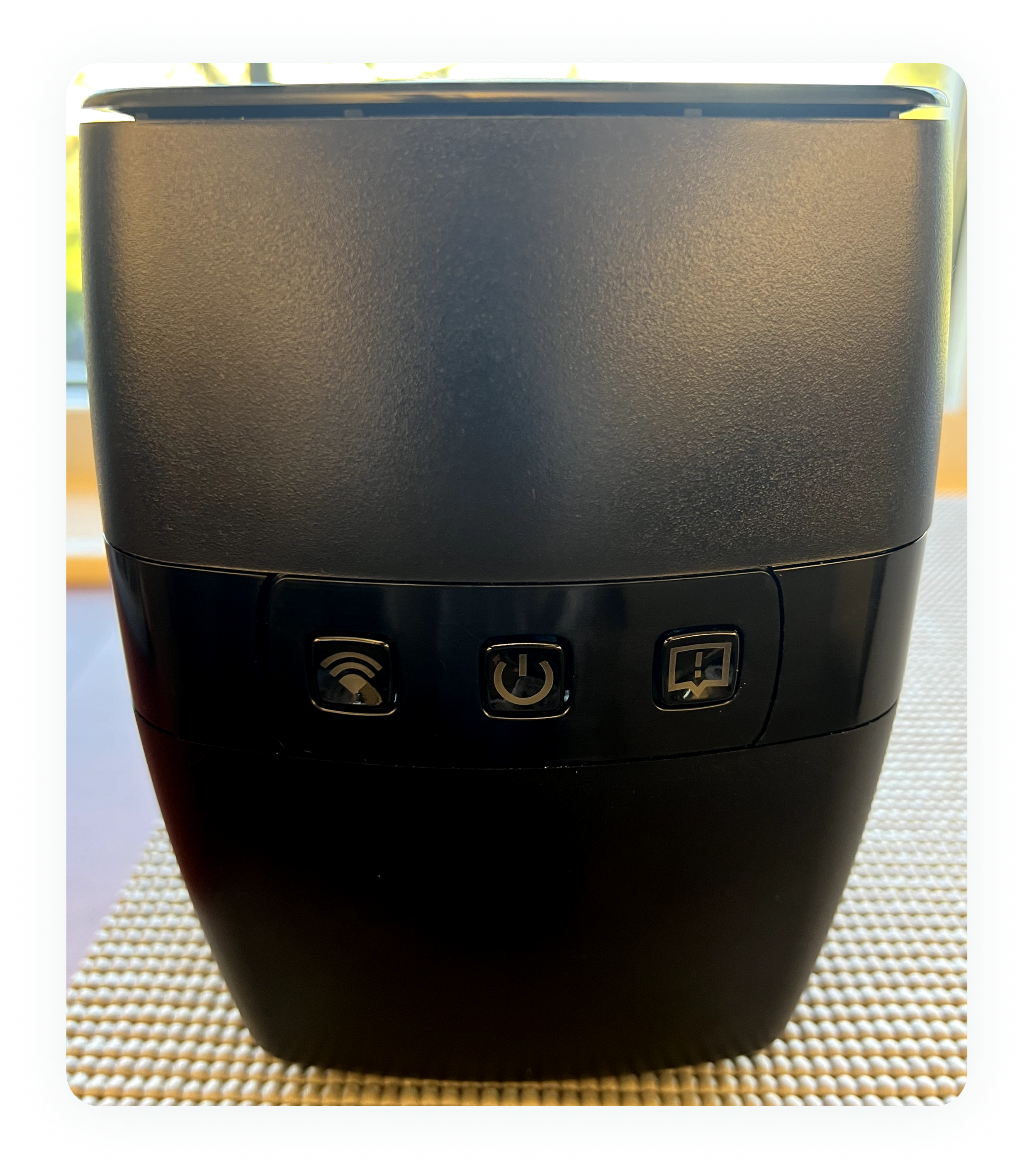
I reduced the new interface to three LED-lit buttons. Removing the clear panel saved money in tooling and solved the light bleeding from the backlit buttons.
Reducing the LEDs not only saved money but also allowed us to simplify the UI.
Base Unit Interface Version 2

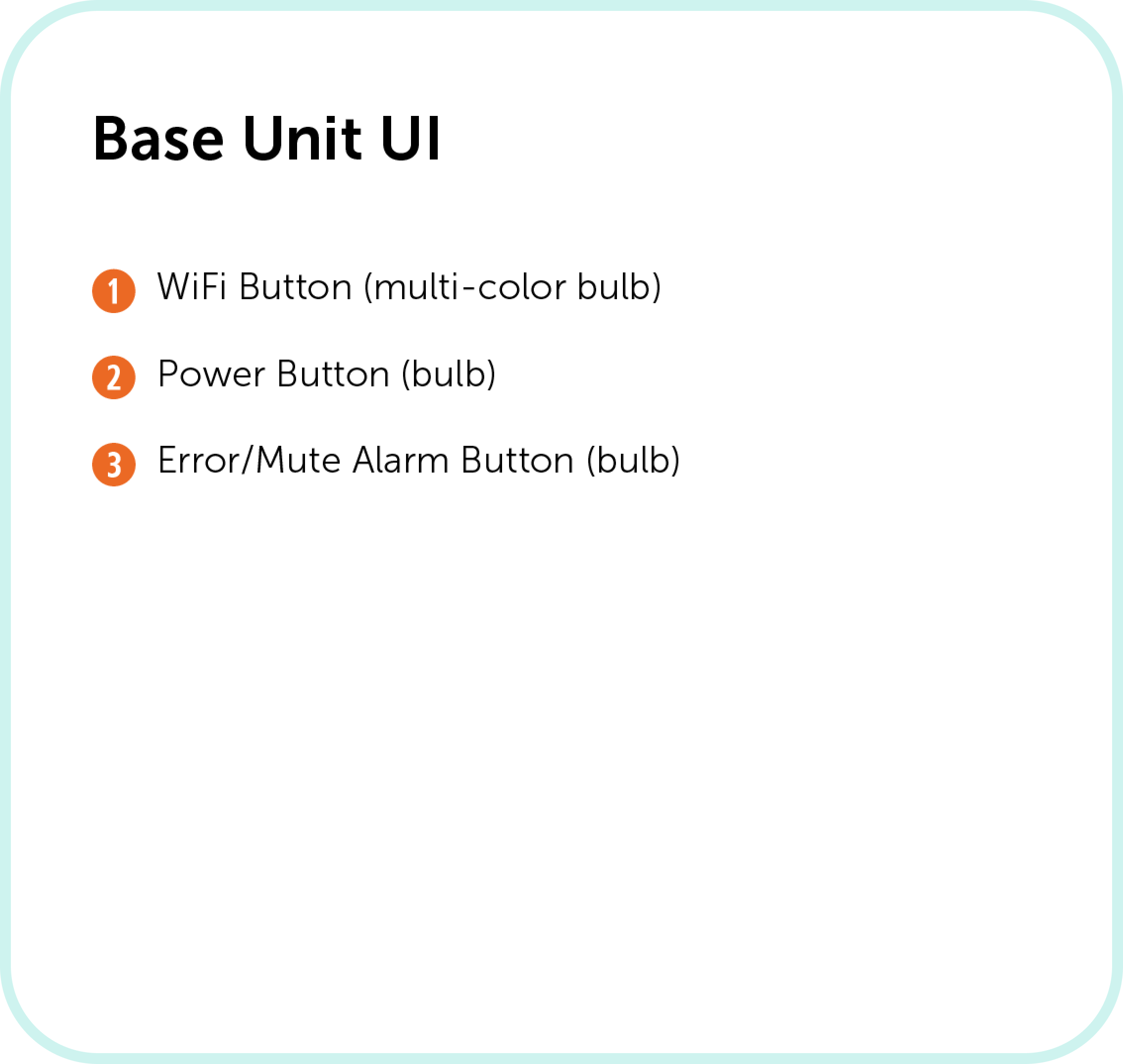
Updated Base Unit Prototype
I created a new icon for the mute alarm/error button and optimized the other icons for use with light. The engineers then used the updated interaction spec to update the product design and UI and created another 3D prototype for UX evaluation.


Reducing Complexity
Fostering good relationships with other team members enabled me to have a potentially hard conversation about significantly changing the UI of the base unit, discuss options, and make changes that improved the overall experience and saved the company money.


