UX Design Project - PetSafe Brands
Testing a product setup experience by rapid prototyping
The project team pivoted from a long-term GPS project to a rapid redesign of a technician-installed pet containment system for DIY customers.
The challenge was clear: translate a 60-page technician manual into an intuitive digital setup experience in just eight days.
This pivot, driven by the urgent need to recapture market share, demanded rapid prototyping, immediate user feedback, and quick validation of our assumptions.
The Problem
What I Did
-

Rapid Prototyping
Leveraging my understanding of the product's technical functionality, I quickly created a navigable Figma prototype based on our setup storyboard.
-

Usability Testing & Iteration
I led rapid usability tests with in-office participants, identifying critical gaps in the setup process. Based on this feedback, the team iterated on the prototype.
-
Final Design & Handoff
After multiple rounds of testing and refinement, we finalized the designs and assets, ensuring a cohesive setup experience within our tight deadline.

Key Project Takeaway
This project highlighted my ability to lead effectively under extreme pressure. My adaptability and quick response to shifting business priorities, combined with my proactive leadership, were crucial in delivering a cohesive setup experience within the demanding 8-day timeframe.
-
Challenges
• Accelerated Deadline. We received the deadline just a week and a half before it was due, demanding rapid design and testing.
• Simplifying Complexity. Translating a complex technician-installed product setup into a simple, intuitive DIY experience.
• Achieving User Confidence. Ensuring we reached the "point of least astonishment" before the deadline required rapid iteration and validation.
• Minimizing Cognitive Load. Reducing cognitive load for users within the limited testing window to ensure a smooth and understandable setup process.
-
Learnings
• Consistent Fidelity Matters. Mixing mid- and high-fidelity screens in usability tests led to participant confusion.
• Visuals Clarify. Adding hand-drawn sketches to mid-fidelity screens effectively provided necessary visual context.
• Fast Iteration Works. Quick design changes followed by immediate testing resulted in significant usability improvements.
• Pressure Drives Innovation. While stressful, the tight timeline fostered creative problem-solving and pushed me to develop efficient design and testing strategies.


Discovery Stage
I needed to understand the product functionality and limitations to create a setup experience flow that would quickly set our customers up for success.
Product Research
I led the creation of comprehensive documentation outlining the product's capabilities and limitations, based on information from stakeholder interviews.
This documentation served as a crucial reference point for designing the app's user interface.


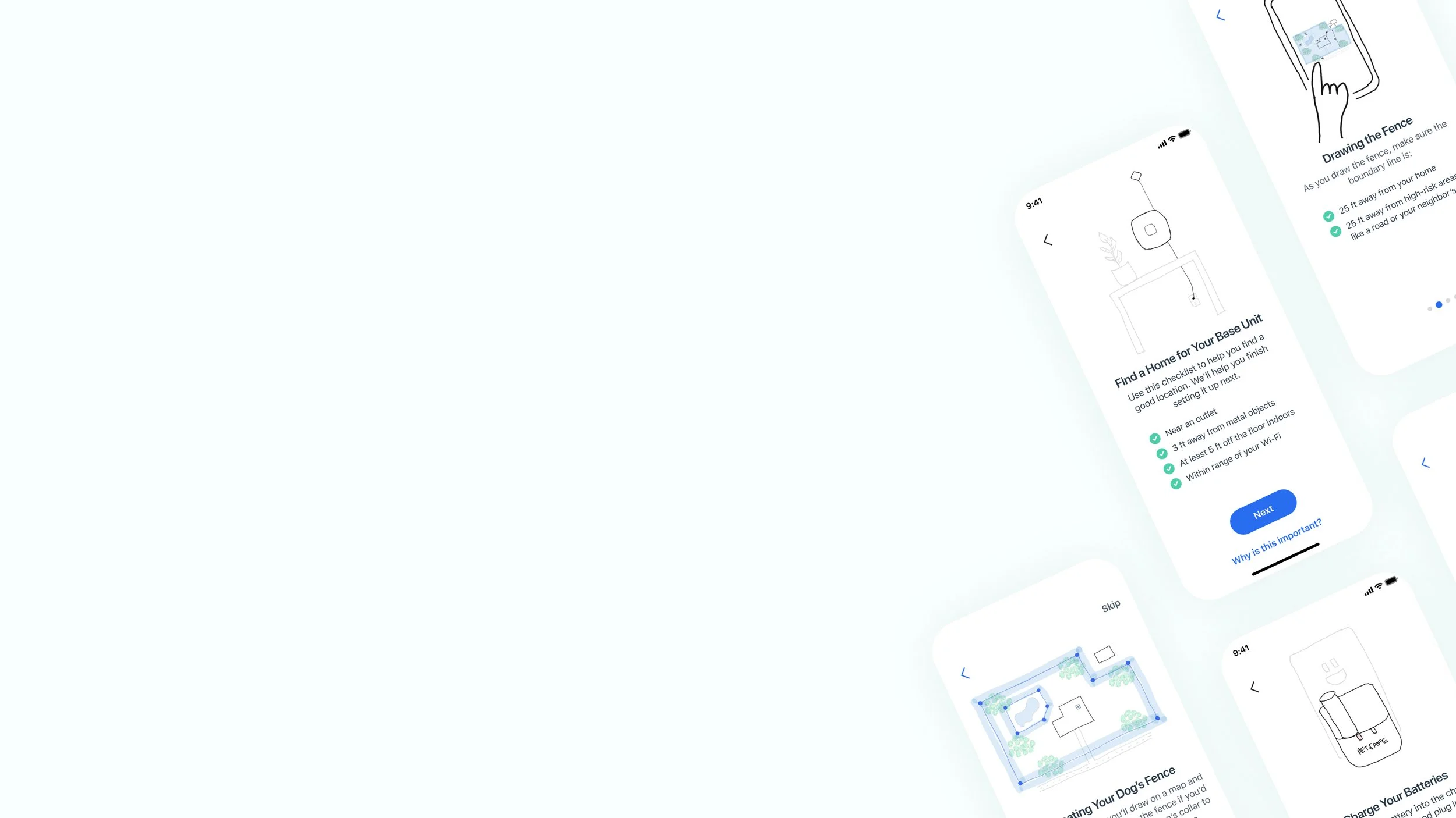
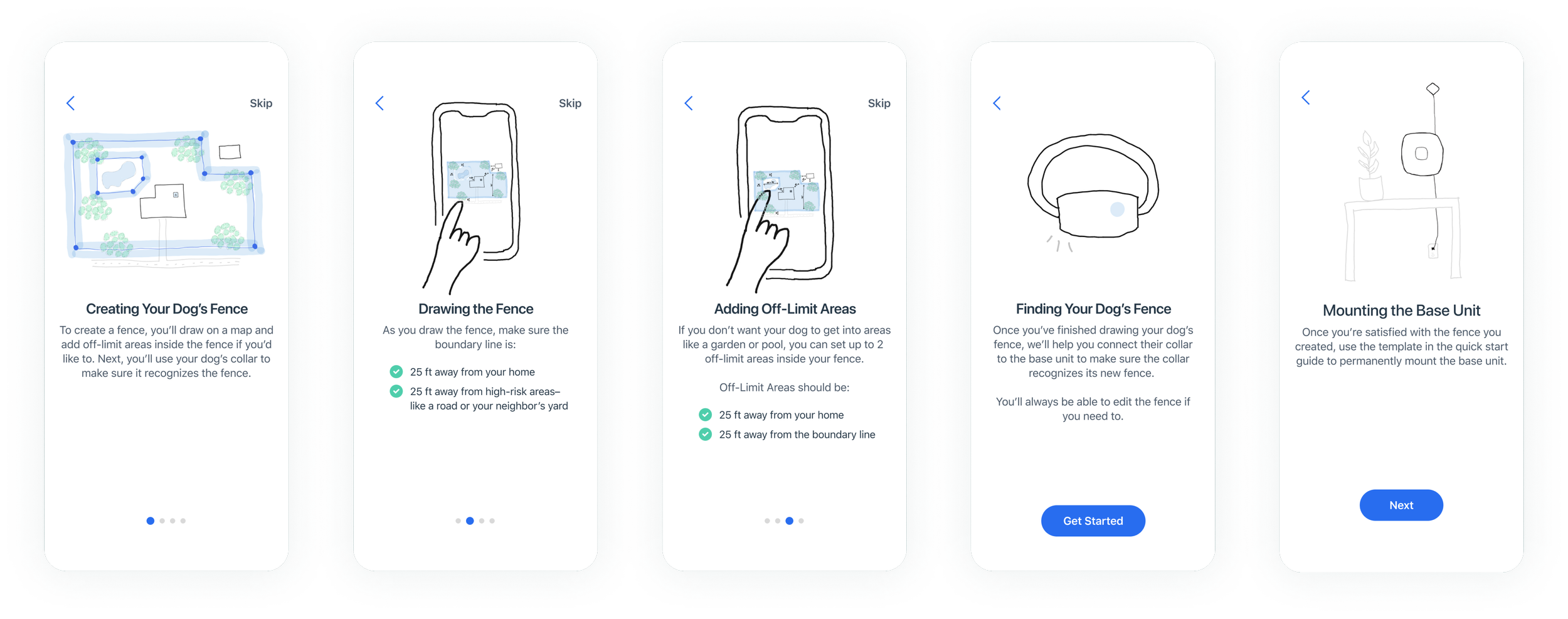
Setup Prototype One
For the first iteration of the setup prototype, I used a mixture of mid-fidelity and high-fidelity screens to move quickly as we only had a week and a half to design the app experience, screens, and assets.


Testing Prototype One
After creating a navigable Figma prototype using the mid and high-fidelity screens, I led efforts to test the setup experience with in-office participants.
Evaluating Usability
After giving participants brief context about the product, I asked them to add the product to their account and complete the setup process using the navigable prototype.
We watched participants interact with the prototype, listened to any questions they had as they completed the steps, and asked clarifying questions of our own to learn more about their experience and confidence.
Our main goal was to validate our ideas and flow and learn areas that needed to be improved.

Prototype One Learnings
We quickly learned participants were confused by the placeholder images–sometimes thinking they were supposed to take actions in the placeholders and sometimes needing more visual context to understand the tasks they were being asked to complete.
Key Takeaways
Participants were confused by the mixture of mid and high-fidelity screens.
Participants perceived the setup experience as easy even when experiencing confusion.
Participants struggled to understand some of the terms we used.


Setup Prototype Two
Based on learnings from the initial round of testing, I created simple sketches to replace the image placeholders to help add visual context for participants. We also made some minor content changes to add needed clarity.


Testing Prototype Two
After quickly updating the prototype, we began testing again the same day with more in-office participants.
Evaluating Usability
With the confusion resolved by the sketches and content updates, we evaluated other areas of the setup experience.
This allowed us to validate the setup flow, identify further improvements, and document technical limitations that impacted the user experience.
Prototype Two Learnings
We learned participants needed more context about how the system was working. Not providing this additional level of context created confusion for participants.


Key Takeaways
Participants were confused by the collar and base unit communication relationship.
Participants expressed they thought the setup experience was both intuitive and easy.
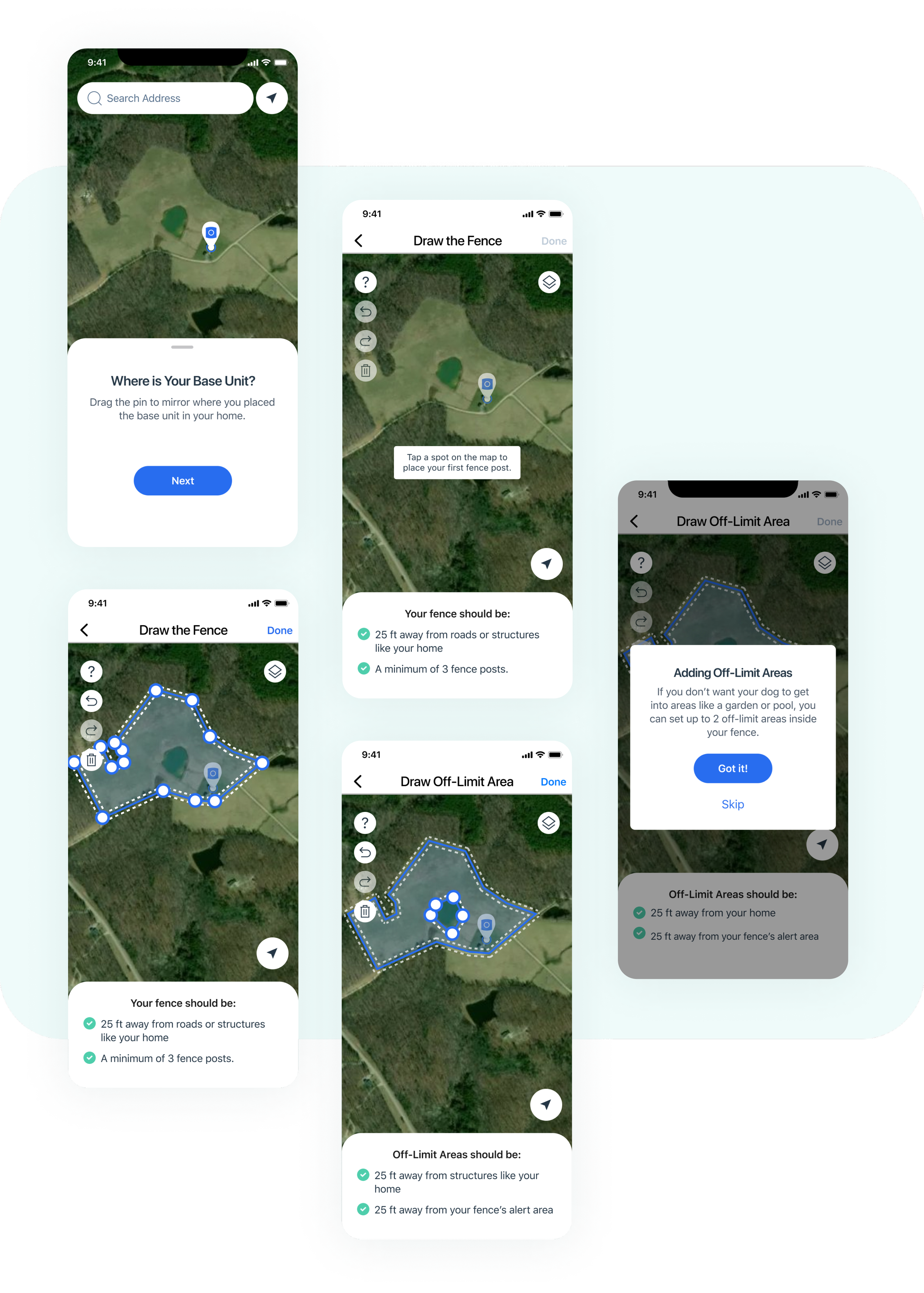
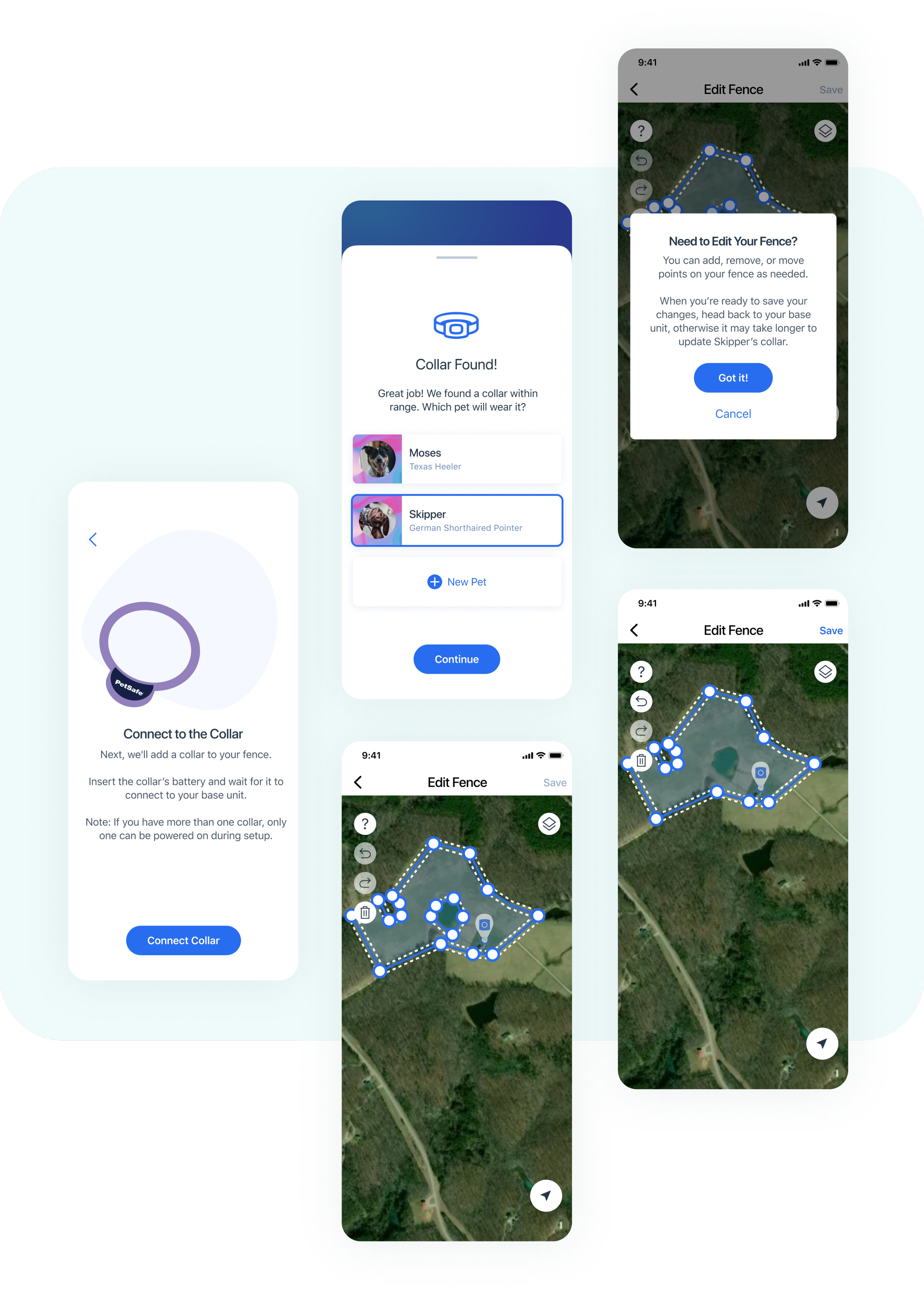
Setup Prototype Three
I led the team in creating a final prototype informed by our rapid prototyping and testing, successfully delivering all app screens and assets to developers within the 1.5-week deadline.


